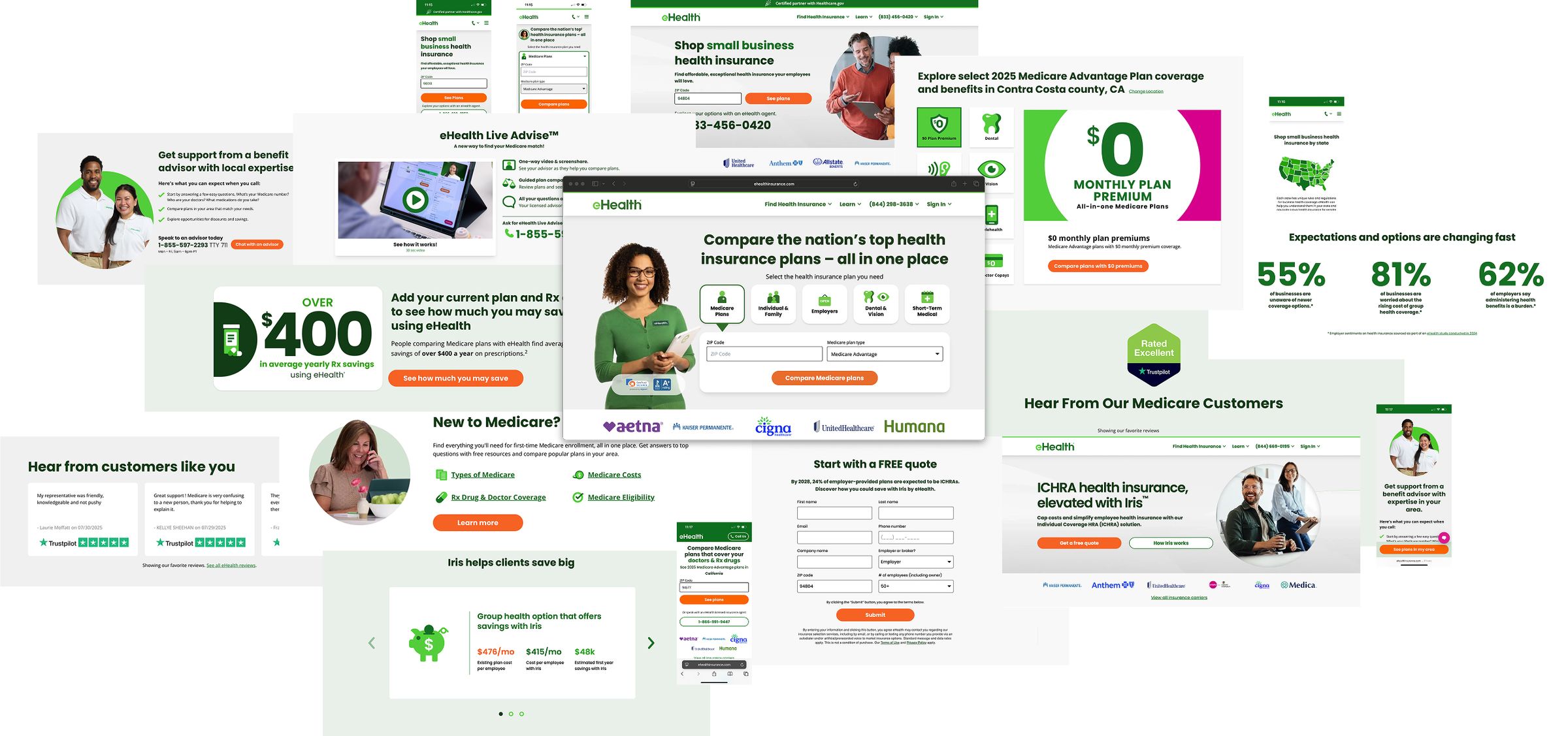
eHealth Online
Creating a great digital experience is difficult and never achieved without a lot of effort and persistence.
The core challenge was finding and closing the friction points that caused users to abandon the journey — a classic “leaky bucket,” with drop-off at nearly every stage after a user arrived through marketing or organic channels.
Product discovery
The team layered qualitative and quantitative research — user research, page-level analytics, session recordings, A/B test results, heat maps, competitive analysis, and site surveys — and worked cross-functionally with Product Managers, Content Designers, and Data Analysts to document personas end-to-end and map the journey in detail.
Finding leaks
Layering multiple data sources and focusing on the most common user types surfaced the major pain points quickly; the smaller friction areas took deeper, more deliberate investigation to uncover.
Top of the funnel
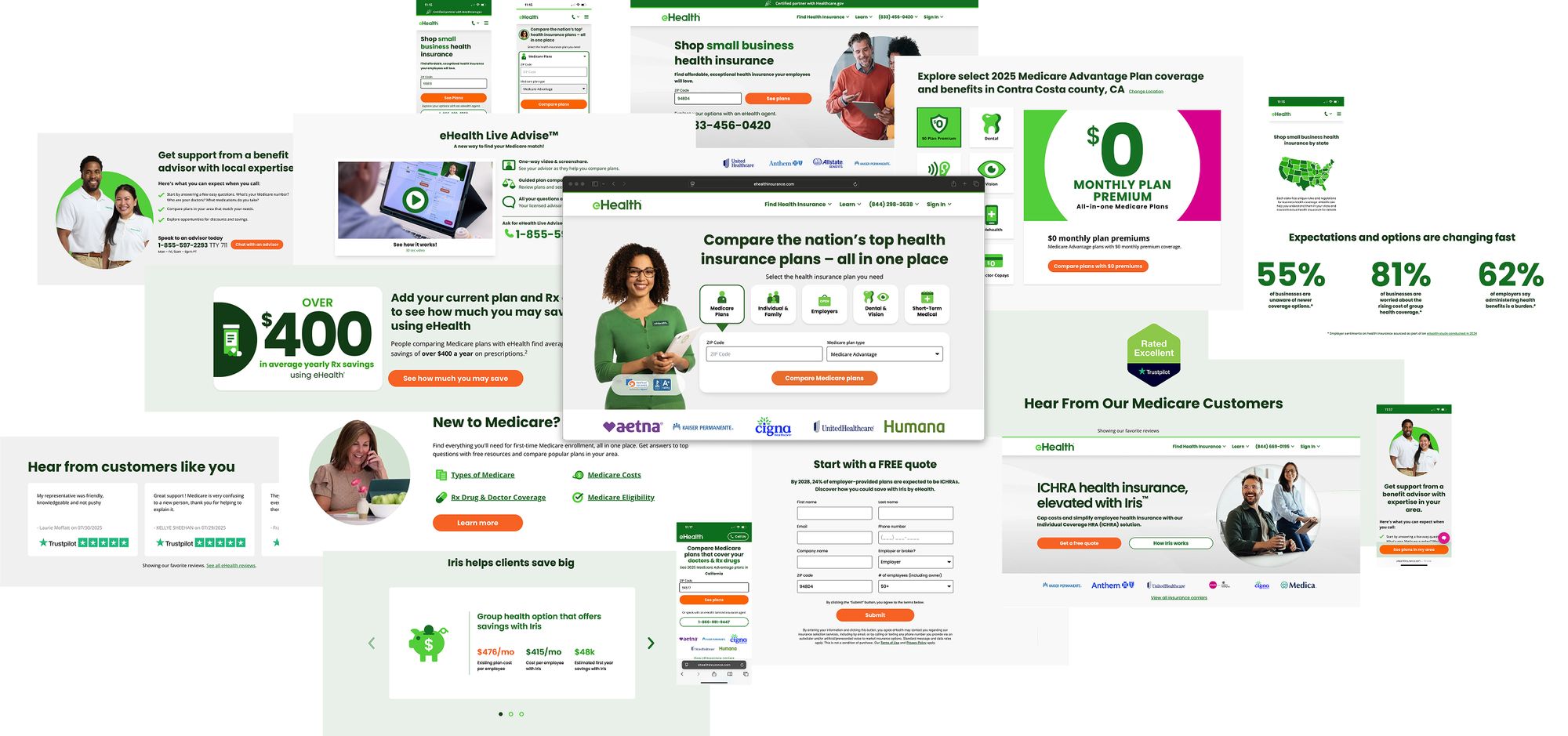
The team built a headless WordPress platform for modular page construction, with dynamic elements that customized messaging by state and ZIP code, plus flexible phone-number toggling to balance phone conversion against site conversion without hurting either.
Plan shopping: tools and layout
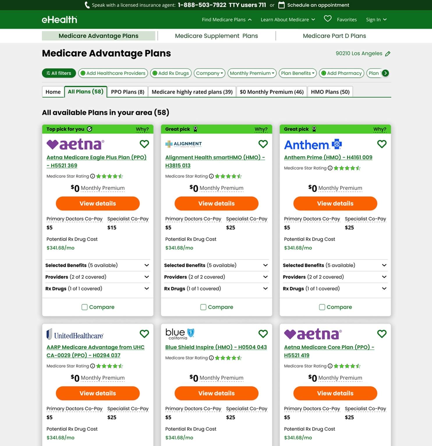
Early testing showed users became overwhelmed by plan volume without filtering tools. A key insight: users who added their doctors and drugs converted at twice the rate of those who didn’t — correlation, not proof, but a strong signal. Moving filters from a vertical to a horizontal layout alone lifted conversion 15%.
Shifting from stacked plan cards to a side-by-side layout that supported comparing three plans at once was the bigger structural win, and testing which data belonged on the card versus the details page simplified the cards considerably.
Enrollment
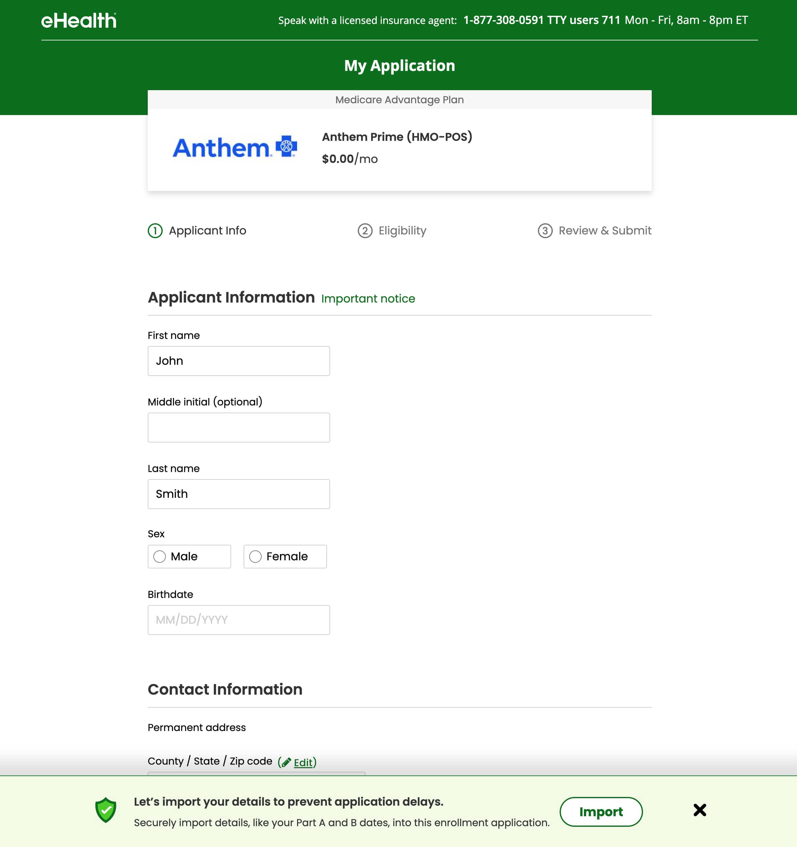
Regulatory constraints meant the question order and wording had to match the approved paper application exactly. Within that constraint, the team improved the experience with pagination, helper text that demystified insurance terminology, simplified input selection, and auto-fill to improve speed and accuracy.
Patched leaks
Beyond the step-function wins, a steady stream of smaller improvements — removing unnecessary clicks and friction — compounded over time. Every change was checked against page-level and overall conversion to make sure it wasn’t creating a new leak somewhere else. Desktop and mobile rarely shared solutions, so each was optimized on its own terms, and the throughline across all of it was simplicity: fewer interactions, fewer visual elements, and strict discipline about following the data.
Results
Selected screens